SIR Model for Covid19
It’s been a hectic few months since my last post. Working and schooling at home during this pandemic chaos is challenging, but it doesn’t stop the hope of renew and transformation. One of the most popular statistcal modeling method for epidemiology and network science-Spreading Phenomena is SIR (susceptible-infected-recovered) model from Tim Churches.
Susceptible (S): Healthy individuals who have not yet contacted the pathogen.
Infectious (I): Contagious individuals who have contacted the pathogen and hence can infect others.
Recovered/Removed (R): Infected individuals become immune or die, i.e., will not be infected again and cannot infect anyone else.
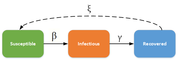
As shown in the picture above, there are two important rates \(\beta\)(transmission rate of the pathogen), \(\gamma\)(recovery rate). You probablily heard of the basic reproduction number \(R_0\) value (R-nought), which can be calculated by \(\frac{\beta}{\gamma}\).
If \(R_0\) > 1, epidemic is in the epidemic state;
If \(R_0\) < 1, epidemic dies out.
The purpose of the post is to estiamte the basic reproduction number R-nought / \(R_0\) value based on US data and then make predictions for the future.
1. Load packages:
#install.packages(c("httr", "jsonlite"))
library(httr)
library(jsonlite)
#install.packages("optimr")
library(optimr)
library(deSolve)
library(tidyverse)
library(lubridate)
2. Retrieve data from John’s Hopkins and use date March 1st till March 15 to fit SIR Model and check if the fit is reasonable:
#by Johns Hopkins CSSE
res = GET("https://pomber.github.io/covid19/timeseries.json")

data = fromJSON(rawToChar(res$content))
#names(data) all contries
US = data$US
US$date=as.Date(US$date)

new<-US %>% dplyr::filter(date>= "2020-03-01"& date<"2020-03-15") #for US data only
head(new) #first six rows
## date confirmed deaths recovered
## 1 2020-03-01 32 1 7
## 2 2020-03-02 54 6 7
## 3 2020-03-03 74 7 7
## 4 2020-03-04 107 11 7
## 5 2020-03-05 184 12 7
## 6 2020-03-06 237 14 7tail(new) #last six rows## date confirmed deaths recovered
## 9 2020-03-09 589 22 7
## 10 2020-03-10 782 28 8
## 11 2020-03-11 1145 33 8
## 12 2020-03-12 1584 43 12
## 13 2020-03-13 2214 51 12
## 14 2020-03-14 2971 58 123. build SIR Model and find \(\beta\) and \(\gamma\) by optimization method RSS:
#Initial values:
Infected <- new$confirmed
Day <- 1:(length(new$date))
N<-327200000 #US population
init <- c(S = N - Infected[1], I = Infected[1], R = 0) #Inital value

## SIR Model
SIR <- function(time, state, parameters) {
  par <- as.list(c(state, parameters))
  with(par, {
    dS <- -beta * I * S/N
    dI <- beta * I * S/N - gamma * I
    dR <- gamma * I
    list(c(dS, dI, dR))
  })
}

#Optimization by RSS to get beta and gamma
RSS <- function(parameters) {
  names(parameters) <- c("beta", "gamma")
  out <- ode(y = init, times = Day, func = SIR, parms = parameters)
  fit <- out[, 3]
  sum((Infected - fit)^2)
}

Opt <- optim(c(0.5, 0.5), RSS, method = "L-BFGS-B", lower = c(0,0), upper = c(1, 1))

Opt_par <- setNames(Opt$par, c("beta", "gamma"))
Opt_par
## beta gamma
## 0.6755947 0.3244053#R0
Opt$par[1]/Opt$par[2]## [1] 2.0825634. Plot the predicted value vs raw data
sir_start_date <- "2020-03-01"
t <- 1:as.integer(ymd("2020-03-15") - ymd(sir_start_date))

# get the fitted values from our SIR model
fitted_cumulative_incidence <- data.frame(ode(y = init, times = t,
                                              func = SIR, parms = Opt_par))
# add a Date column and join the observed incidence data
fitted_cumulative_incidence <- fitted_cumulative_incidence %>%
  mutate(date = ymd(sir_start_date) + days(t - 1)) %>%
  left_join(new %>% ungroup() %>% select(date, confirmed))
## Joining, by = "date"# plot the data
fitted_cumulative_incidence %>%
ggplot(aes(x = date)) + geom_line(aes(y = I), colour = "red") +
geom_point(aes(y = confirmed), colour = "orange") +
labs(y = "Cumulative incidence", title = "COVID-19 fitted vs observed cumulative incidence, US 03/01-03/15",
subtitle = "(red=fitted incidence from SIR model, orange=observed incidence)")
5. The fit looks reasonable with R0=1.78, now we use the model to predict the curve for 3 months starting from March
#Prediction
# time in days for predictions
t <- 1:90
# get the fitted values from our SIR model
fitted_cumulative_incidence <- data.frame(ode(y = init, times = t,
                                              func = SIR, parms = Opt_par))
# add a Date column and join the observed incidence data
fitted_cumulative_incidence <- fitted_cumulative_incidence %>%
  mutate(date = ymd(sir_start_date) + days(t - 1)) %>%
  left_join(new %>% ungroup() %>% select(date, confirmed))
## Joining, by = "date"# plot the data
fitted_cumulative_incidence %>% ggplot(aes(x = date)) + geom_line(aes(y = I),
colour = "red") + geom_line(aes(y = S), colour = "black") +
geom_line(aes(y = R), colour = "green") + geom_point(aes(y = confirmed),
colour = "orange") + scale_y_continuous(labels = scales::comma) +
labs(y = "Persons", title = "COVID-19 3 months prediction") +
scale_colour_manual(name = "", values = c(red = "red", black = "black",
green = "green", orange = "orange"), labels = c("Susceptible",
"Recovered", "Observed incidence", "Infectious"))
Conclusion: It looks like the peak will be in the end of April and it will die down at the end of May.
Yuan Du
Senior Data Scientist
My interests include applied Statistics, Machine Learning, Deep Learning and Healthcare.